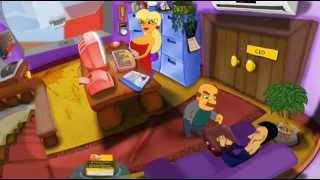
One helluva day - Demo.
by romakok
Need feedback about demo.
One_helluva_day - Demo
Self-centered CEO trying to save his company from bankruptcy forced to rescuing whole town from impending disaster.
Funny, old school cartoon point and click adventure in the style of "Lucas Arts" and In the tradition of "The day of tentacle". Inspired by games like "Sam and max hit the road" and "Secret of the monkey island".
The game is filled, a little crazy tasks. Some of them can be solved in different ways.
The plot tells about the - One unfortunate day of the life ordinary directors of a small firm, full of mysticism, conspiracies, cults and the end of the world.
Funny and crazy and twisted storyline will make you remember the point and click adventure in which you play as a child.
During the passage you will meet fun and interesting characters who amuse you and hint how to get some of the tasks.
Need feedback about demo.
One_helluva_day - Demo
Roasts
error2taco 8 years ago
MechanicsA slightly more mature version of those games sounds like a great idea!
Lorenze 8 years ago
Game Graphics AnimationJamboolio 8 years ago
Level Design Game GraphicsLet's start with good things. You seem to have a good attention to detail and good ideas that you want to show in your game. For instance, I liked the thermometer thing as part of gameplay, or that some clickable buttons are not supposed to be clicked and can lead players who try to game the system to die too early in the game. I also liked the small moments, like when you see the blonde bimbo secretary watching 3D movies on a CRT monitor. I also like that you made it in multiple languages, although you could use some work on the grammar of the English version.
Now for the bad things. First, the artwork, graphics and animation are badly done, even though I can appreciate the style you were going for. Since I assume you're not an artist or an animator, I'm not going to dwell on that too much, but I suggest you limit the movement of characters in the game (like secretary playing paddle-ball animation). Or insert more frames into each animation, but limit the amount of total animated actions that you have to save time. As for the artwork, work on making the colors less attacking to the eyes - there seems to be a lot of contrast in each scene between each object; everything else, I can't really suggest what you can improve. I'm not an animator/artist myself, but I tend to be very shallow when looking at games' artwork, and I assume others can be too.
The other part is that I notice things happening in that video, but it doesn't tell me much about the game. I know this isn't a finished product, but if it was, the teaser didn't sell me. I don't know what the puzzles will be like, and I don't know what happens in the story enough to interest me. Upon watching your youtube playlist, I find more things that interest me and that you should include in the trailer like the snippet of dialogue with the auditor about coffee beans (and it's voiced in Russian, which is good). Also, I noticed an earlier version of the game in that same playlist, and it leads me to the next point.
In that video, the way you set the scenes was much better than in the current version you have now (although the artwork might not be). Why? Because there are less things present and less colors that are distracting me from the main point of the game. Even the Simpsons have less strong colors in each individual scene. But I can understand you wanting to keep the details like trophies, fish bowl and high voltage machine, so my suggestion is this - create a focused screen for each of those desks or parts (like you did for the auditor, separate scene for interaction), but keep them less cluttered in the big picture. I would much rather have you teach me to check every desk through game mechanics (or using one blending color to mark all points of interest), than make me try to click anything with bright colors and letters over it.
Overall, I could tell that you dedicated work to this, and it has redeeming qualities, but it's still not good enough for a person like me to buy it, no matter what the price. And that's ok if you're not going for the commercial part, but for the knowledge and experience from building a game like this. But seeing as it was greenlit on Steam, I have to recommend that you really commit to it, and improve upon the points I mentioned above. I guess the best way would be to look at the games that inspired you (like Monkey Island), and find why they really stand-out when compared to others in the point-n-click genre.
Good luck!
romakok 7 years ago
Wow. Thank you very much for the detailed analysis.Wolod 8 years ago
Mechanics Game Graphicscaptaingamer 3 years ago
Game Graphics Controlssuttonmovies 1 year ago
Game Graphics Level Designig299 10 months ago
Animation Animation


